GOOD'S
0
loading...
Facebook Instagram Youtube
The right way to BE UNIQUE

Baskerville

Having been an early admirer of the beauty of letters, I began to desire, without realizing it, to contribute to their perfection


John Baskerville (1706 – 1775)

IMPRENDITORE
Anima Linotype

Anima Linotype

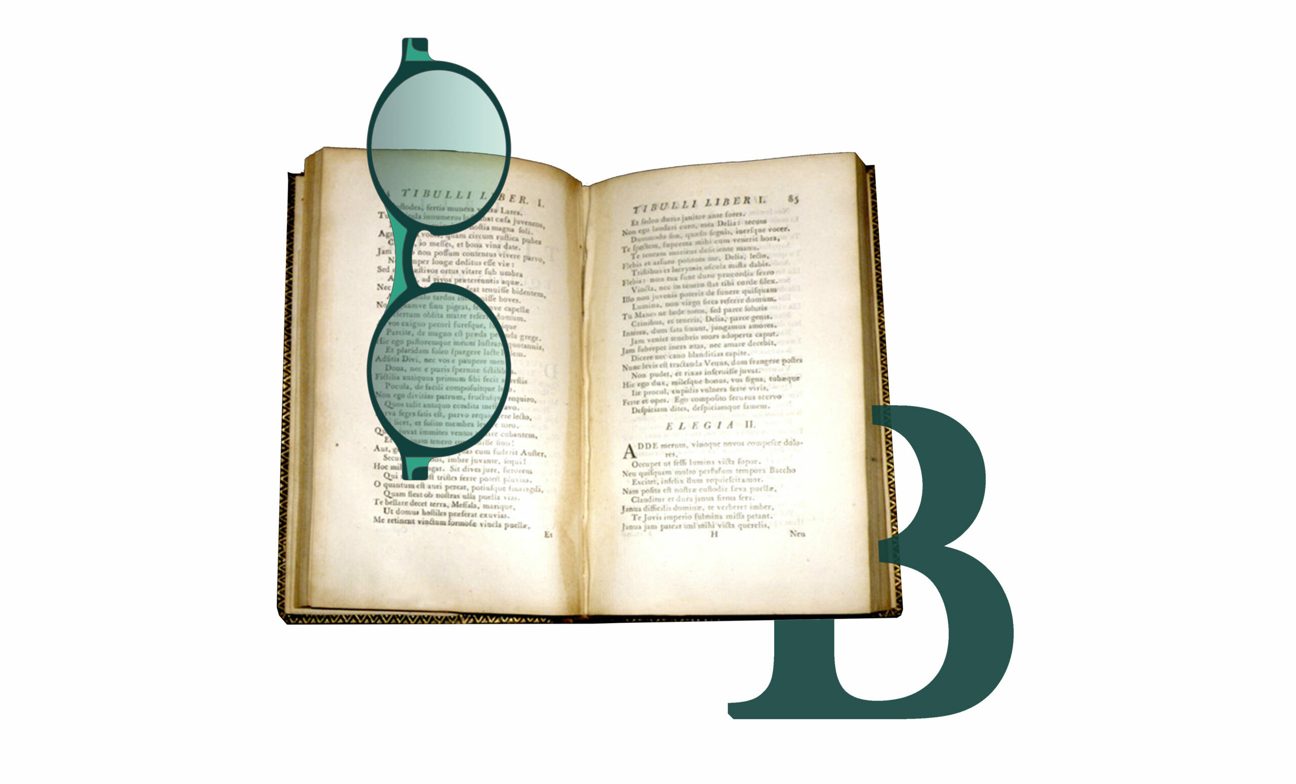
Visible from the outside due to the subtle transparency of the acetate and made to an exclusive Good’s design, it reproduces - with an engraved inscription - the right way to look at things developed from right to left, like the lead lines produced by the traditional Linotype typographic machine, invented in 1886 and defined by Thomas Edison as The Eighth Wonder of the World.

OUT OF STOCK BACK TO STOCK

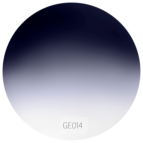
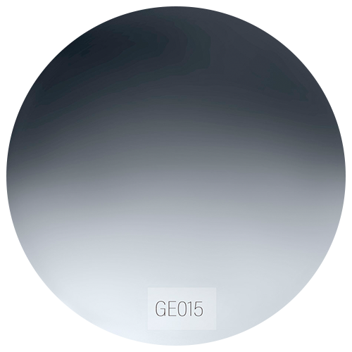
Colore Lenti

Lens Color

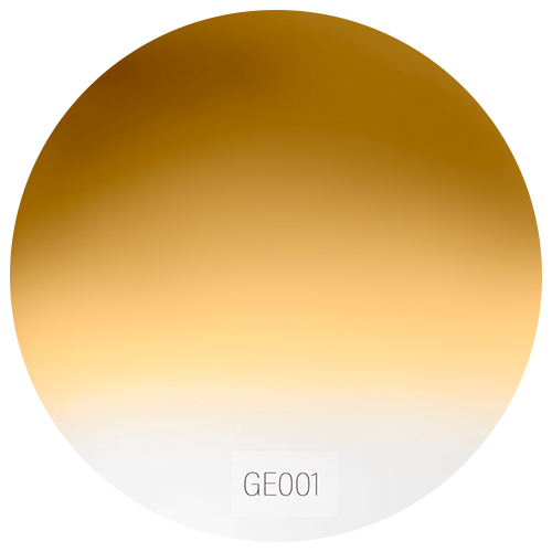
Seleziona il colore delle lenti.

Select the desired color.
  • colorGE001
  • colorGE001
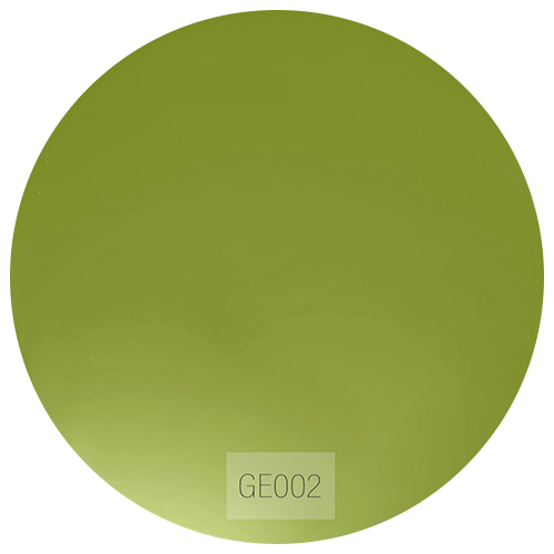
  • colorGE002
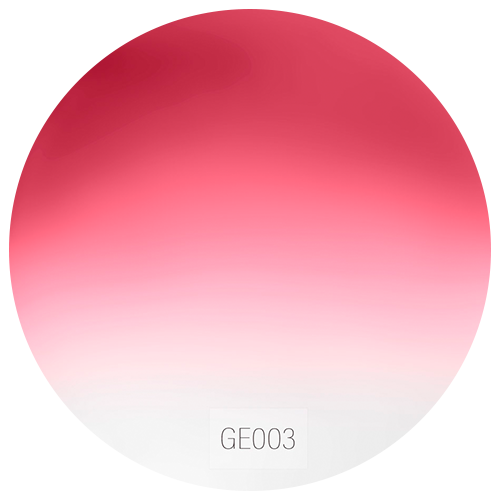
  • colorGE003
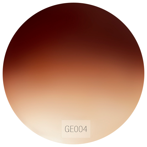
  • colorGE004
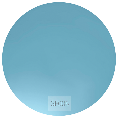
  • colorGE005
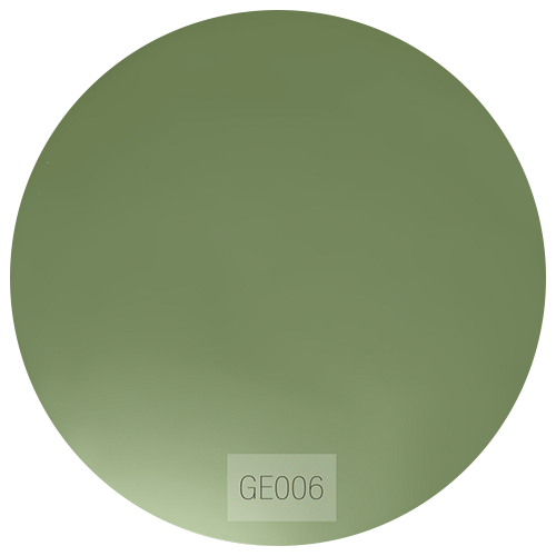
  • colorGE006
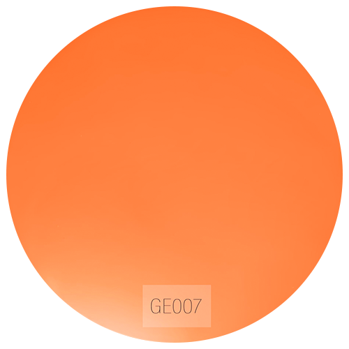
  • colorGE007
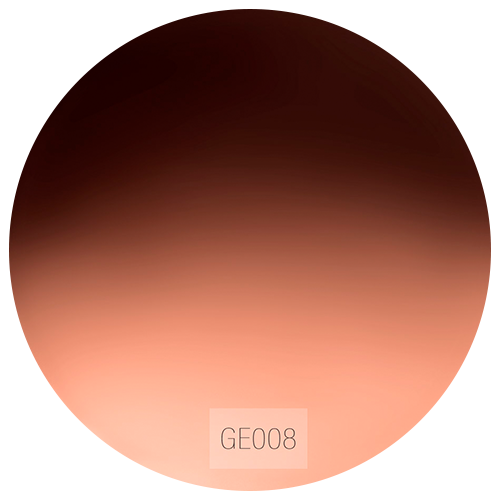
  • colorGE008
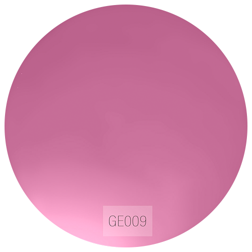
  • colorGE009
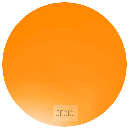
  • colorGE010
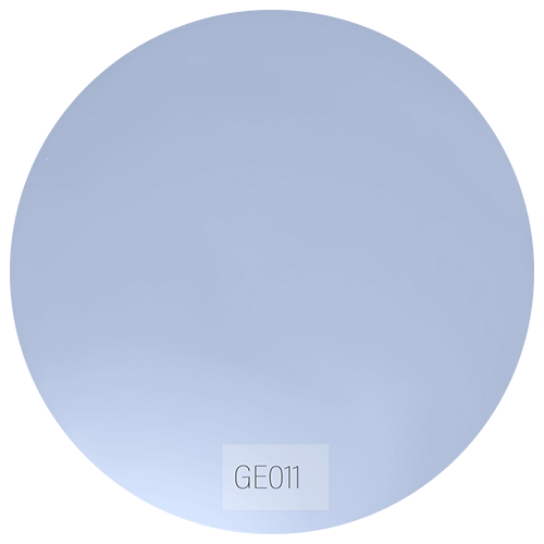
  • colorGE011
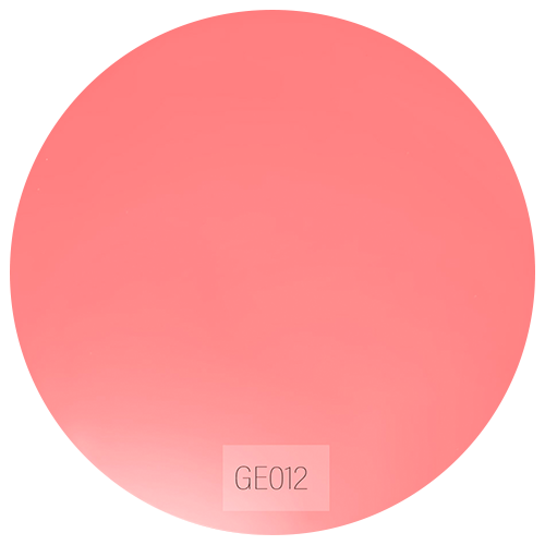
  • colorGE012
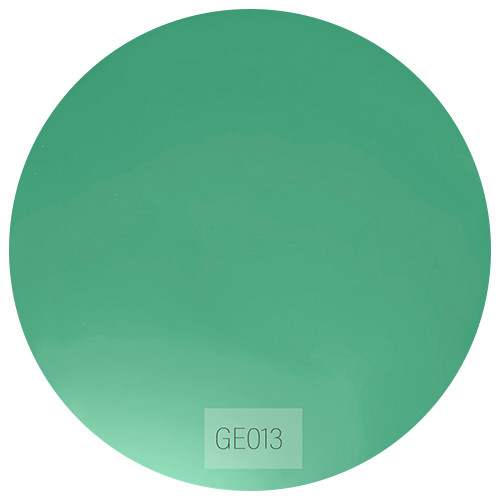
  • colorGE013
  • colorGE014
  • colorGE015

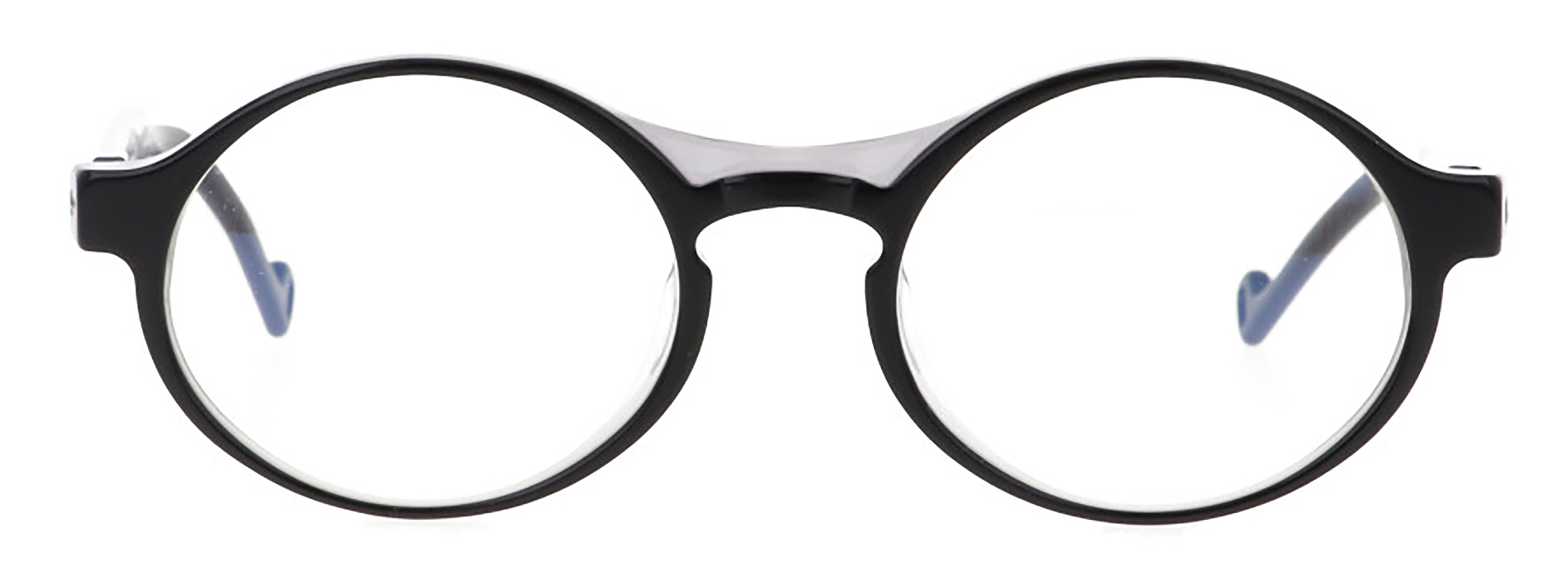
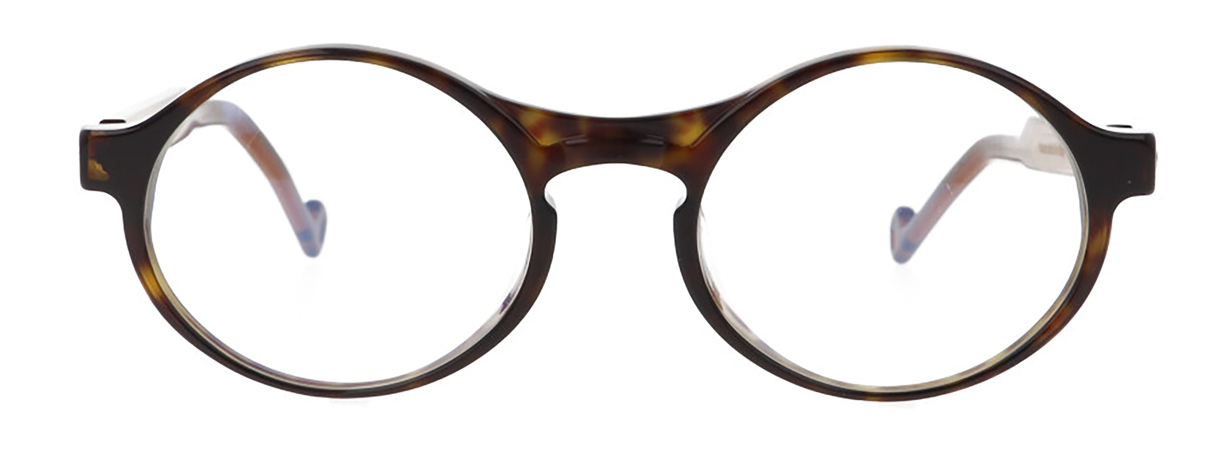
Montatura

Frames

Seleziona la montatura desiderata.

Select the desired frame.


image Frame
image Frame

Inspiration

Our Baskerville frame style is inspired by the typeface of the same name, designed in 1757 in Birmingham by English calligrapher John Baskerville. This typeface was explicitly designed to suit the project of creating high-quality books printed with the finest inks and printing methods using the most cutting-edge and efficient printing presses. From his genius, thus sprang one of the most elegant and legible character sets in the entire history of fonts. Baskerville’s work was not immediately appreciated, but it was much valued abroad, inspiring famous typographers such as Fournier, Bodoni, and even Benjamin Franklin, who brought this font into popularity.

Description

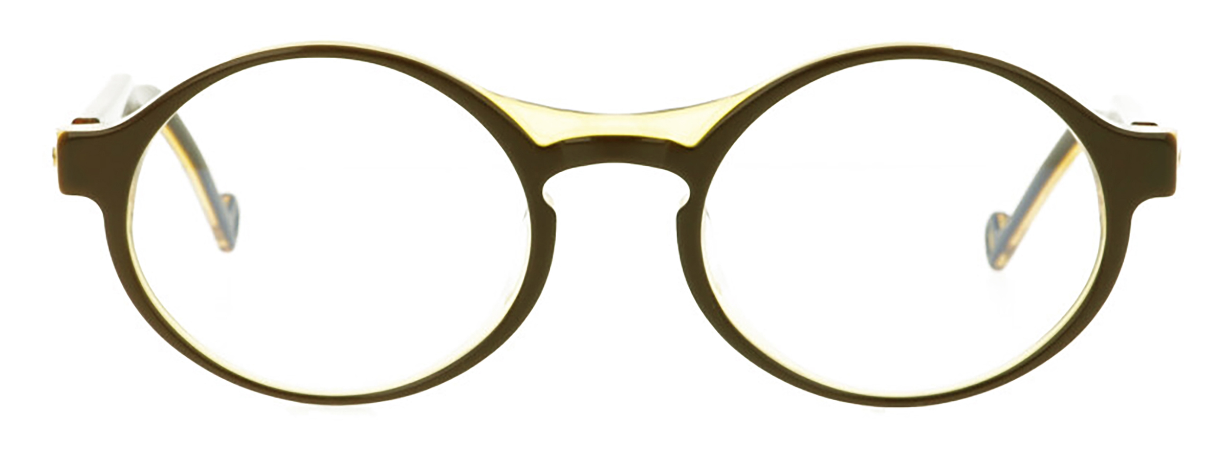
Biocetate: the frame is in Mazzucchelli M49 bioacetate, 100% recyclable and biodegradable, without chemical agglomerates to avoid allergic reactions and its natural origin is also revealed to the touch with a pleasant “warm and silky effect”.

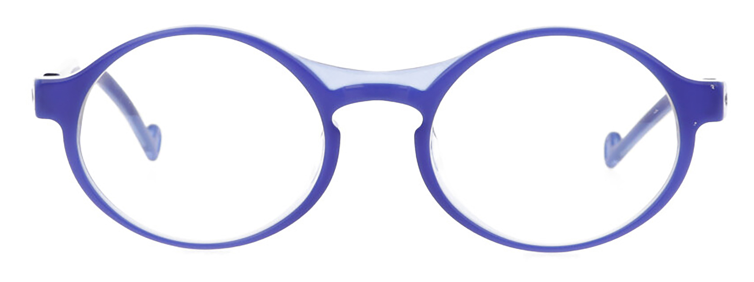
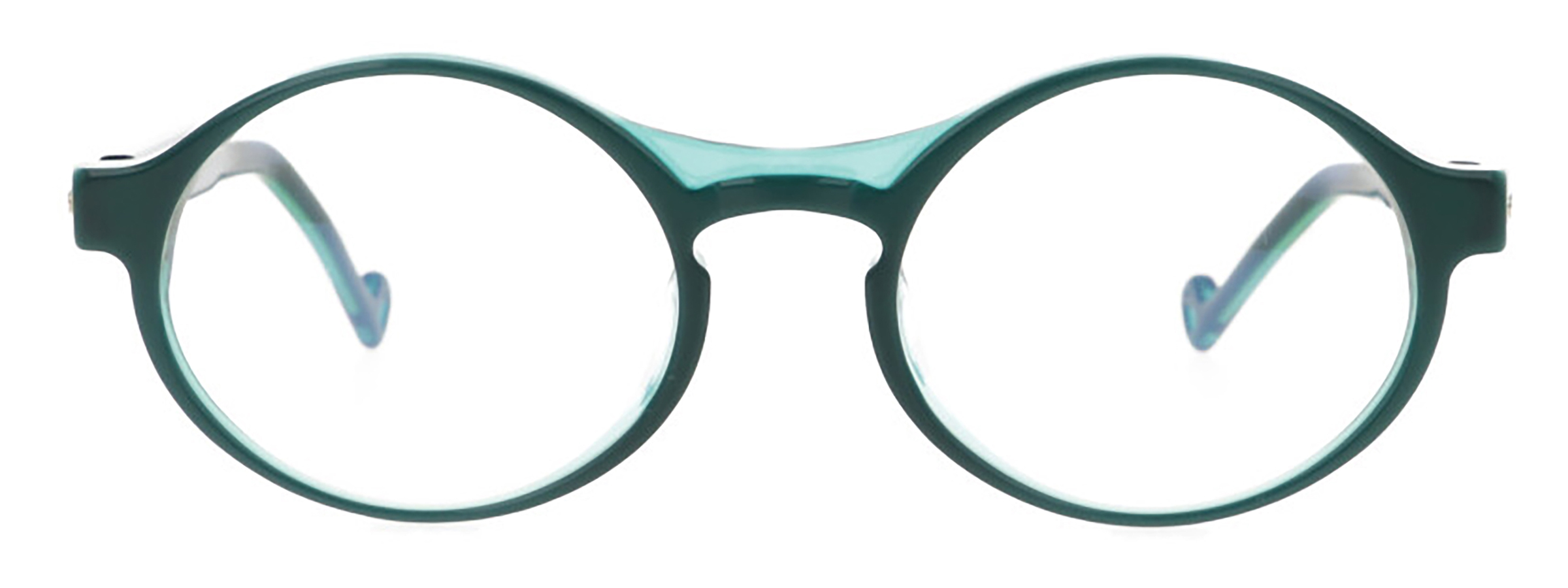
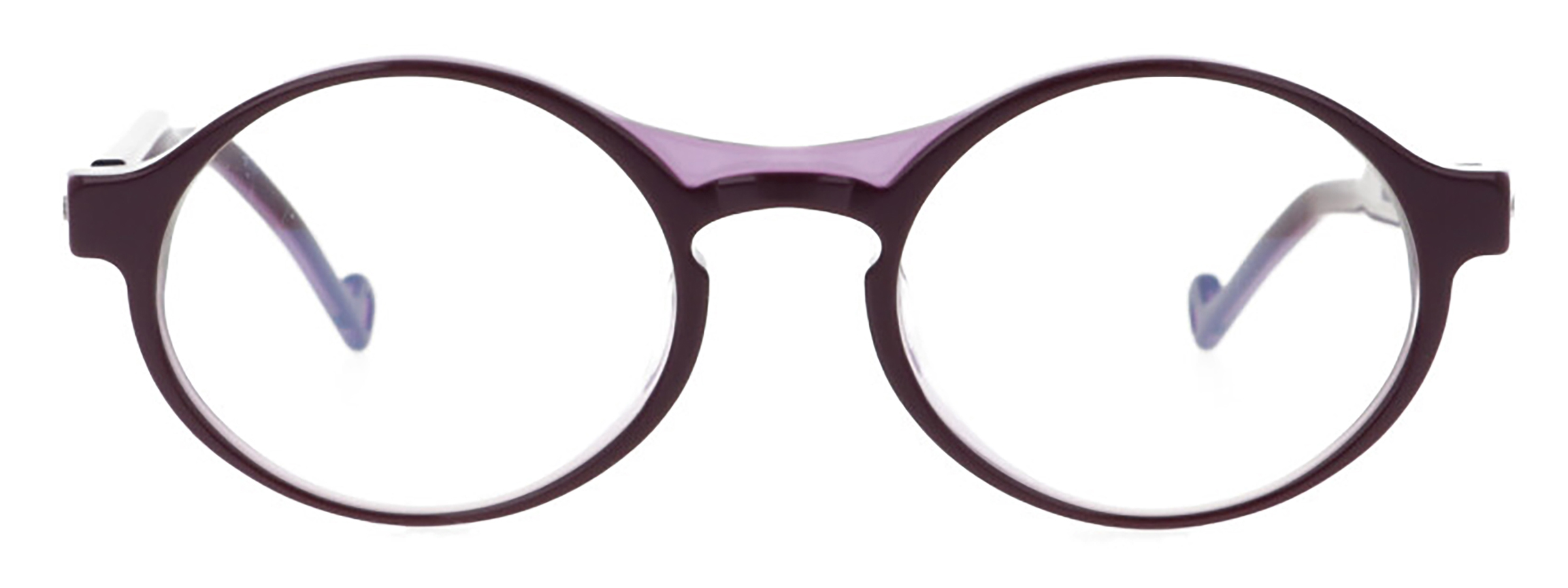
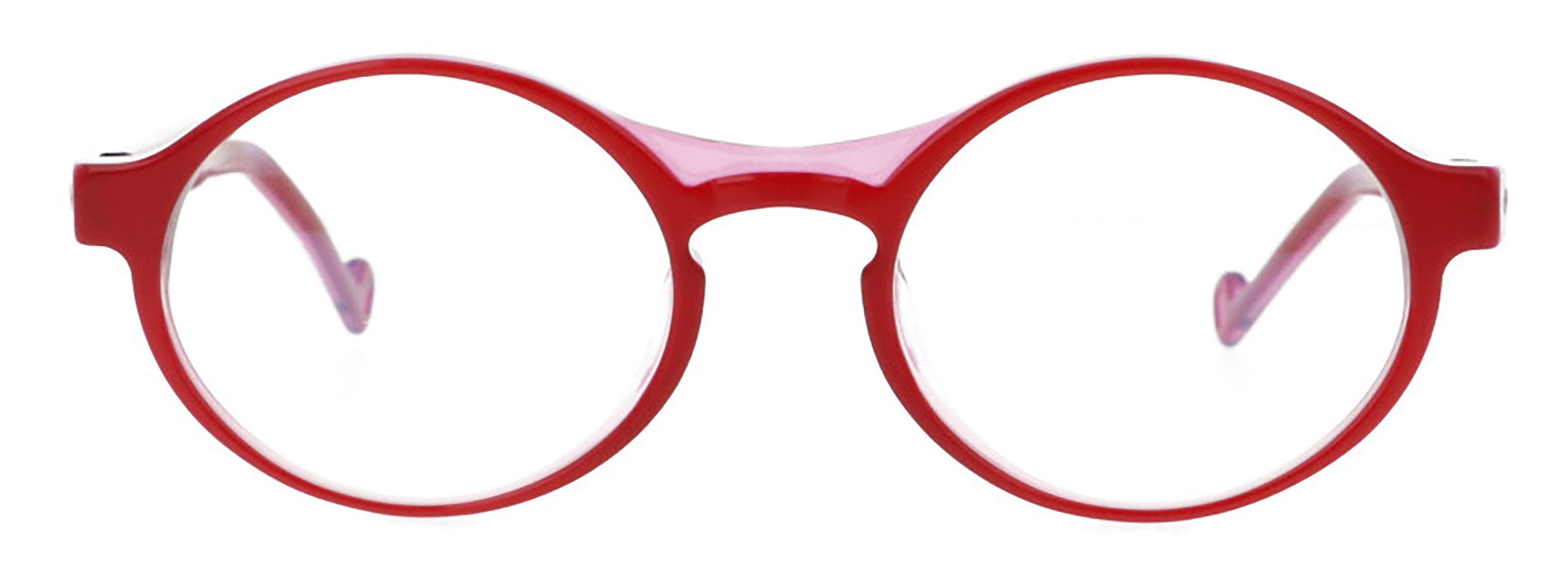
Frame front: the front of this frame style was designed by re-proposing the inspiration typeface proportions and maintaining its uniquely elegant features with the soft lines of clear calligraphic inspiration, which still make Baskerville one of the most beloved fonts today. The opaline top interacts with the translucent base in an interesting trompe d’oeil effect that lightens the frame’s perceptual weight, and the dual colour is enhanced by the special millings in the bridge and snouts.

Temples: the sail-style temples owe their name to the shape that resembles a rudder tiller. The earpiece temple tip is pierced with an “O” inspired by Good’s logo.

Curiosity

“I do not desire to print many books, but only those that are important or of intrinsic merit and of assured fame, which the public may be pleased to see in elegant typeset and to buy at a price that will compensate for the extraordinary care which must necessarily be provided for them.”

(Title page for Baskerville’s edition of Milton’s Paradise Lost)

Specific

  • 100% handmade in Italy
  • 90 PIECES LIMITED EDITION
  • Mazzucchelli M49 bio-acetate, polished by hand
  • Details are all milled and manufactured by hand, through 60 processing steps
  • Nosepad pronounced for a better fit