
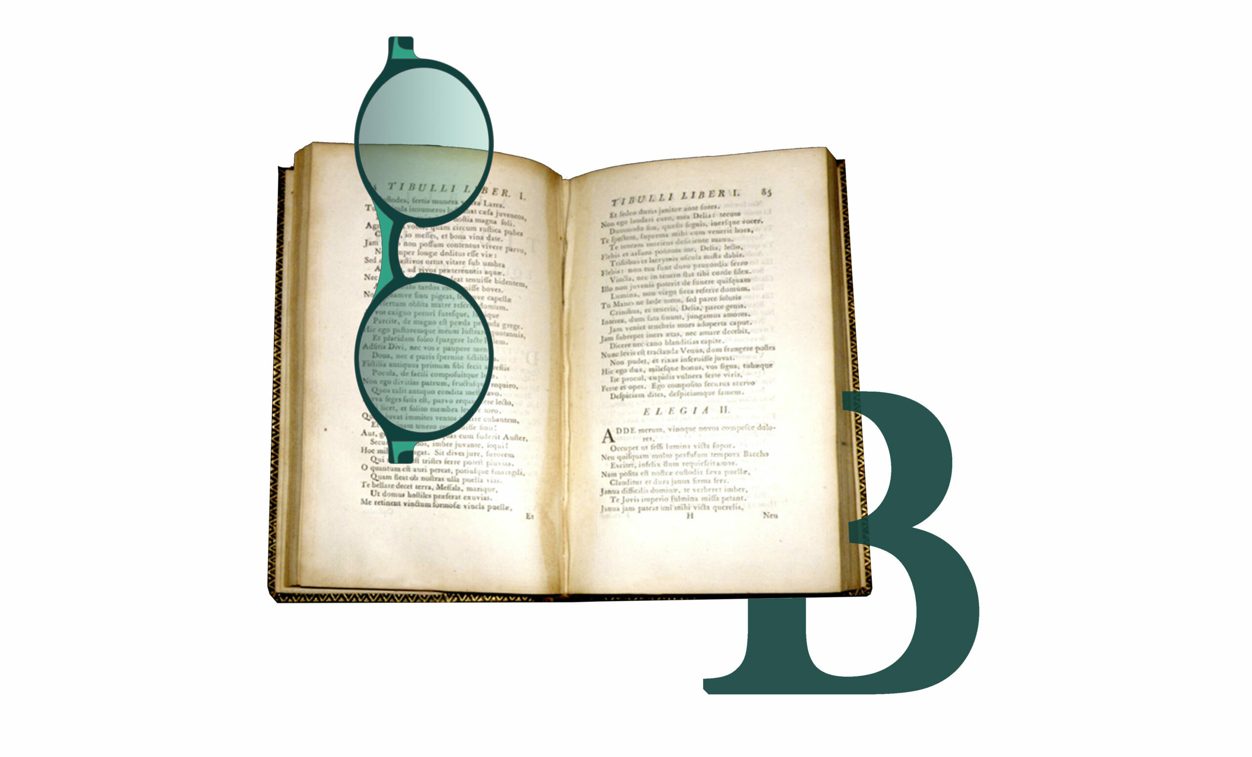
Baskerville
Having been an early admirer of the beauty of letters, I began to desire, without realizing it, to contribute to their perfection
John Baskerville (1706 – 1775)
IMPRENDITORE
Anima Linotype
Visible from the outside due to the subtle transparency of the acetate and made to an exclusive Good’s design, it reproduces - with an engraved inscription - the right way to look at things developed from right to left, like the lead lines produced by the traditional Linotype typographic machine, invented in 1886 and defined by Thomas Edison as The Eighth Wonder of the World.
-
 EYE
50 mm
EYE
50 mm
-
 BRIDGE
19 mm
BRIDGE
19 mm
-
 TEMPLE
145 mm
TEMPLE
145 mm
Colore Lenti
Lens Color
Seleziona il colore delle lenti.
Select the desired color.
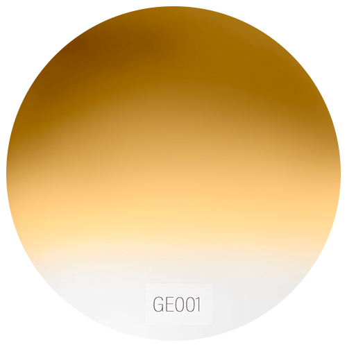 GE001
GE001- GE001
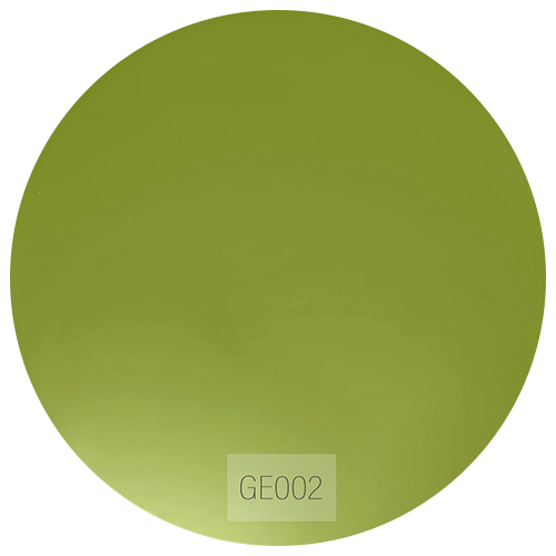 GE002
GE002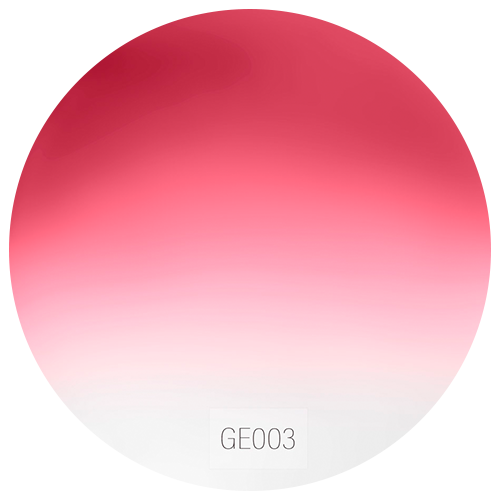 GE003
GE003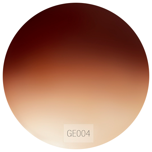 GE004
GE004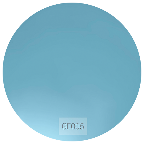 GE005
GE005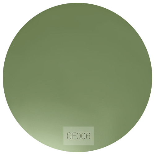 GE006
GE006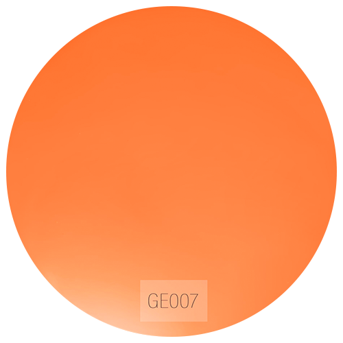 GE007
GE007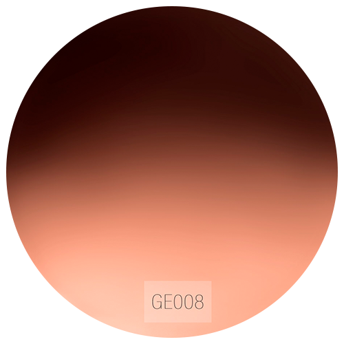 GE008
GE008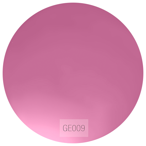 GE009
GE009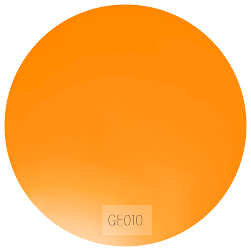 GE010
GE010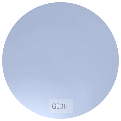 GE011
GE011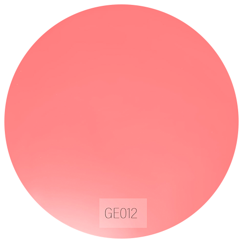 GE012
GE012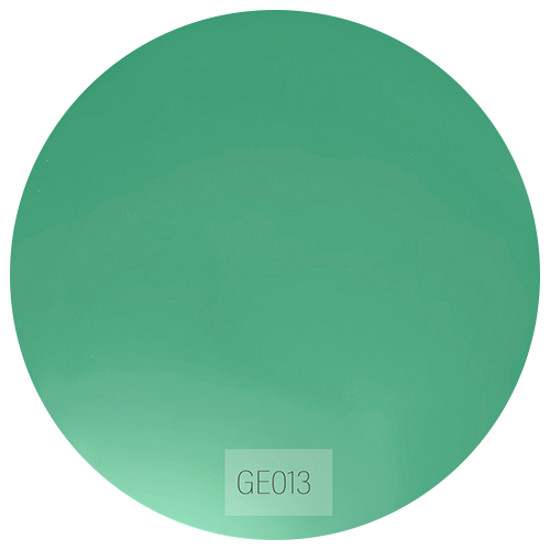 GE013
GE013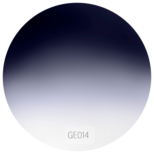 GE014
GE014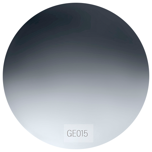 GE015
GE015
Montatura
Frames
Seleziona la montatura desiderata.
Select the desired frame.
-
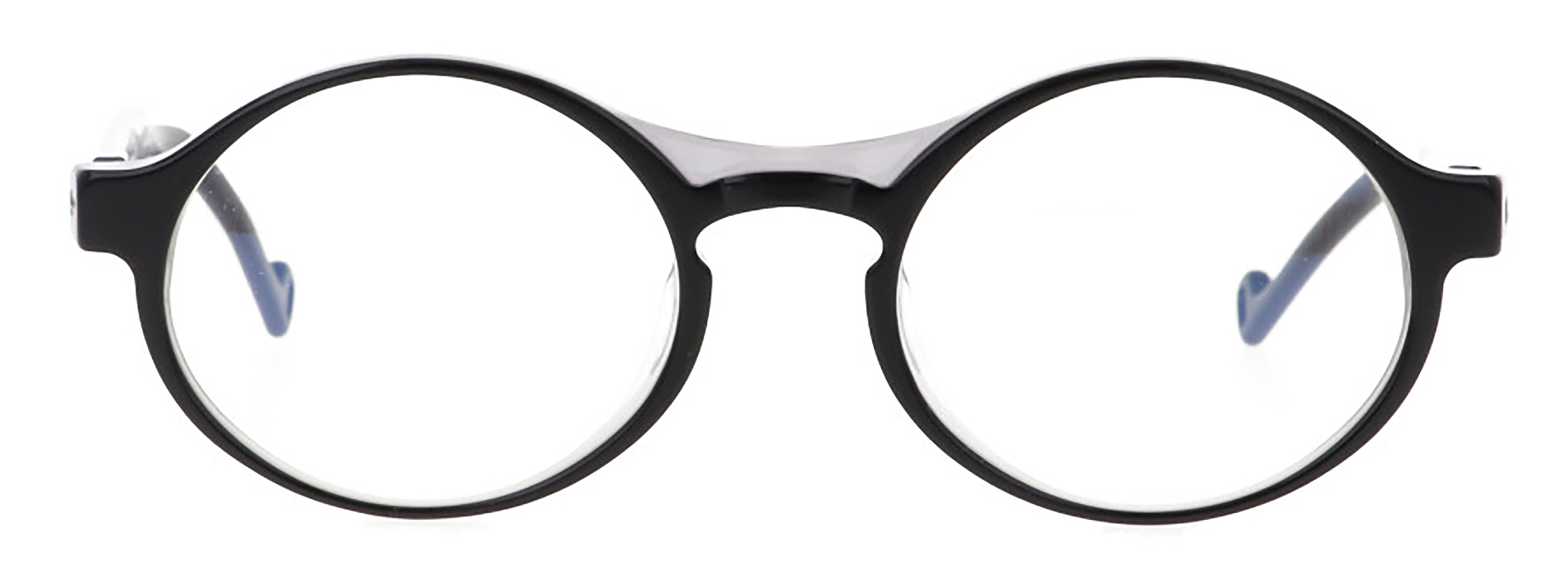
Baskerville C1
NerofumoSilver Soul
-
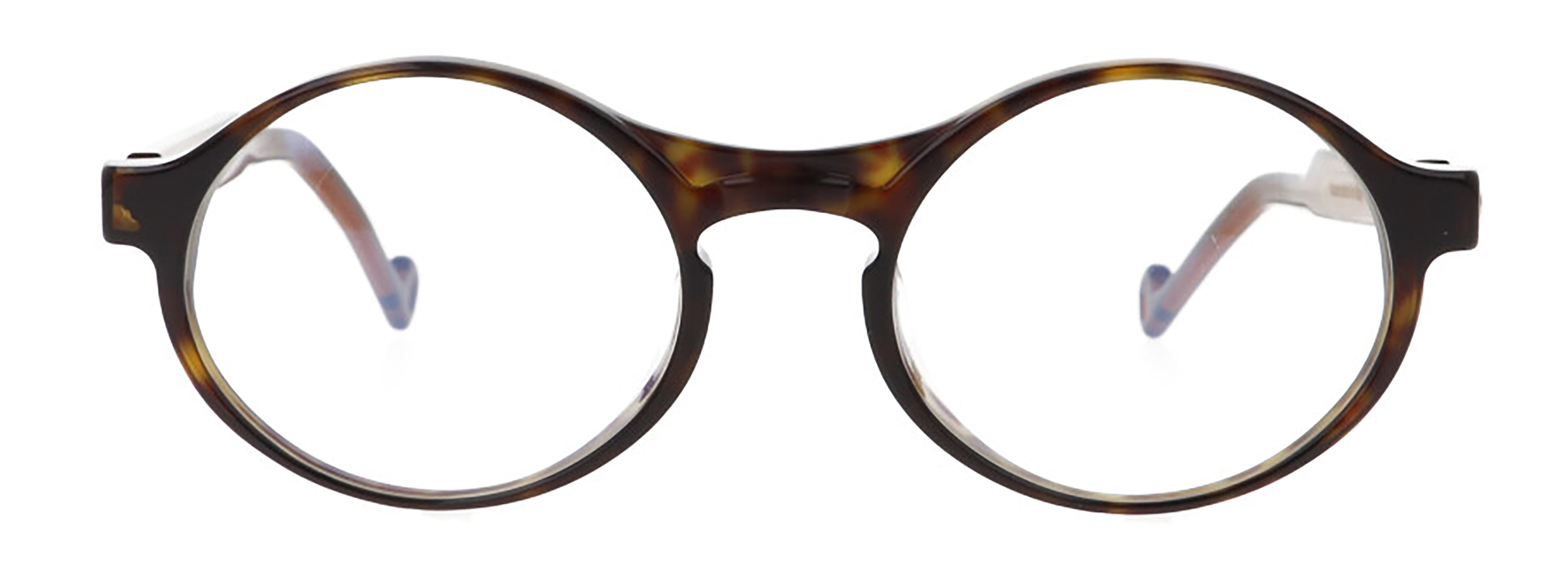
Baskerville C2
Havana tobaccoGolden Soul
-
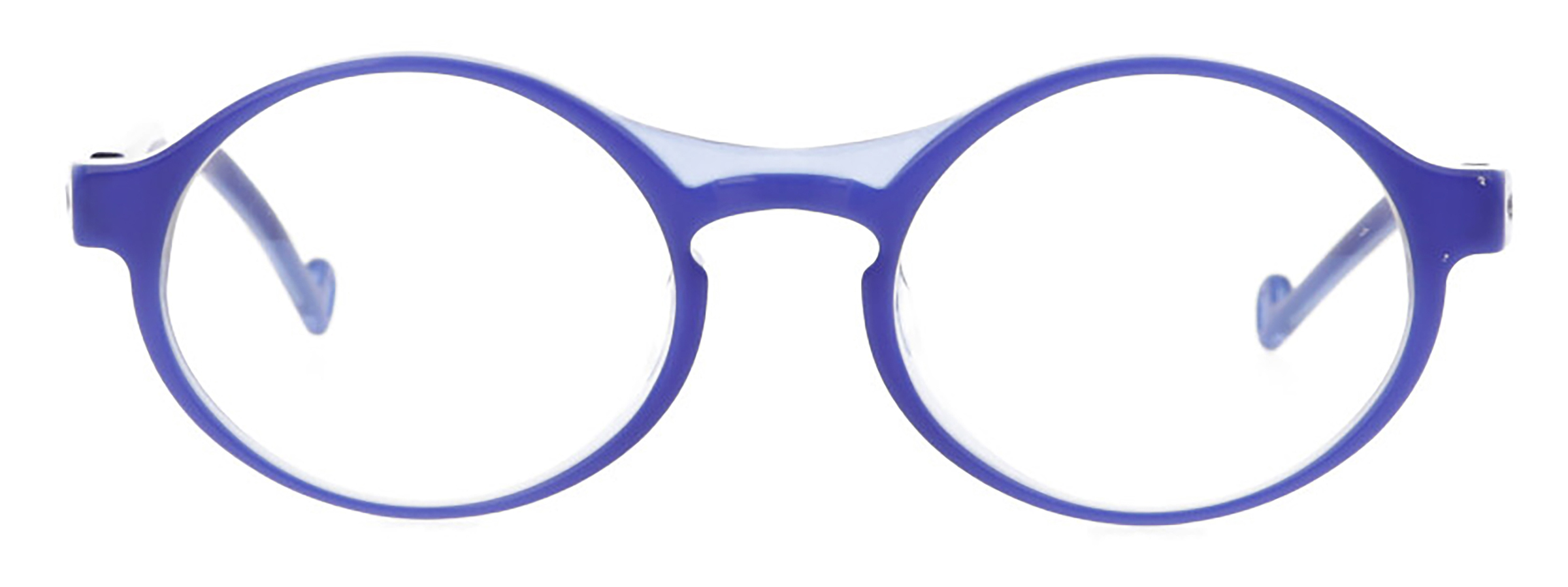
Baskerville C3
AzuriteSilver Soul
-
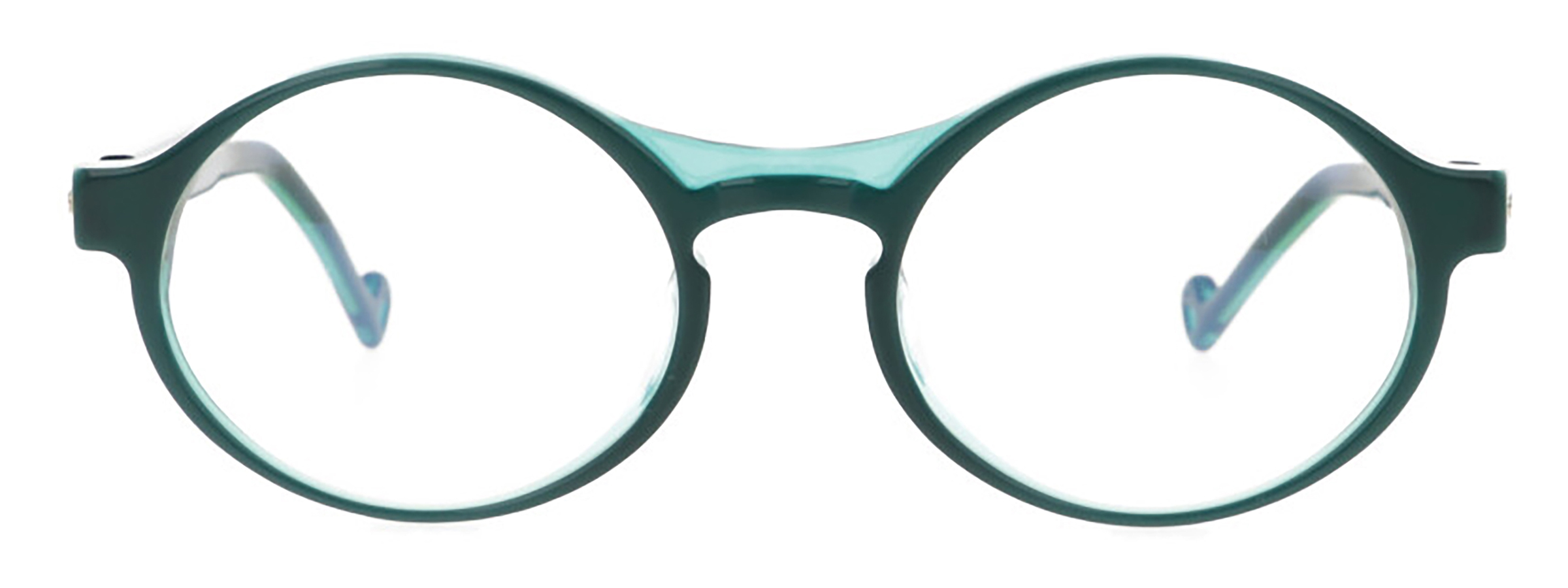
Baskerville C4
MalachiteGolden Soul
-
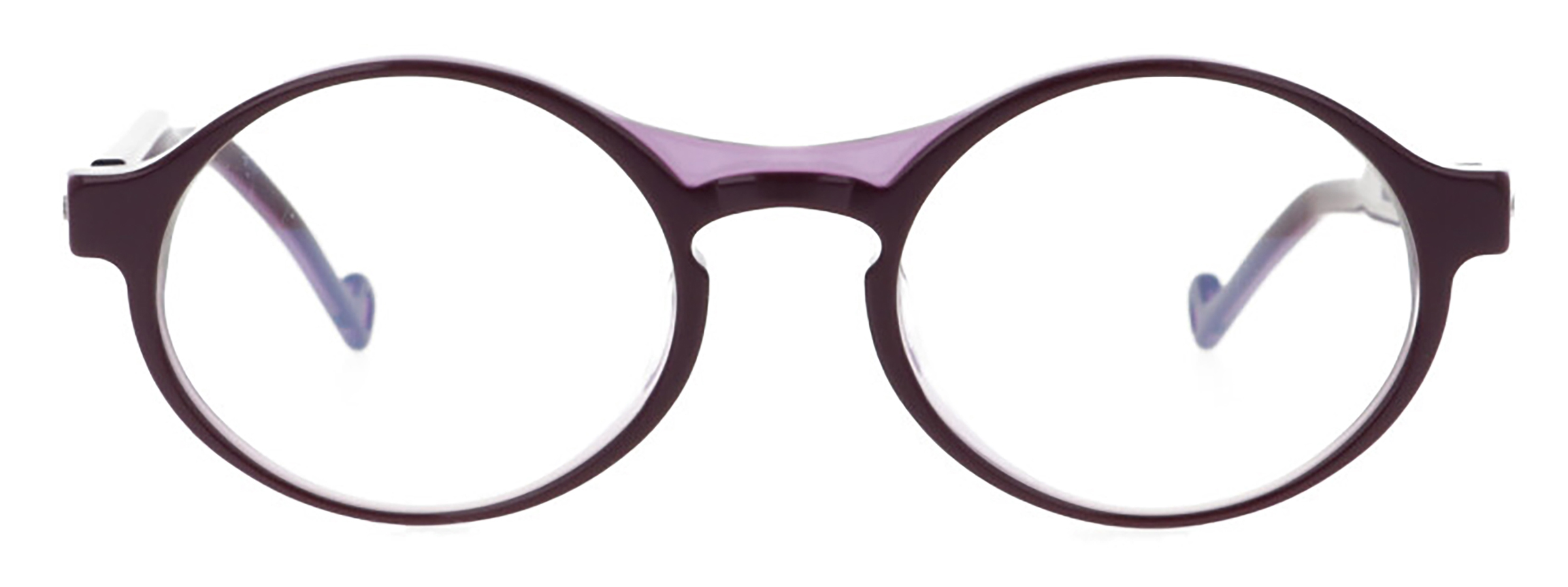
Baskerville C5
ChrozophoraSilver Soul
-
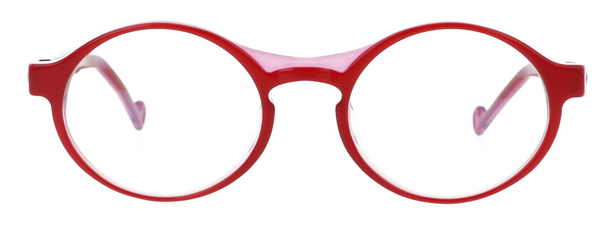
Baskerville C6
Vermillion/ OrceinSilver Soul
-
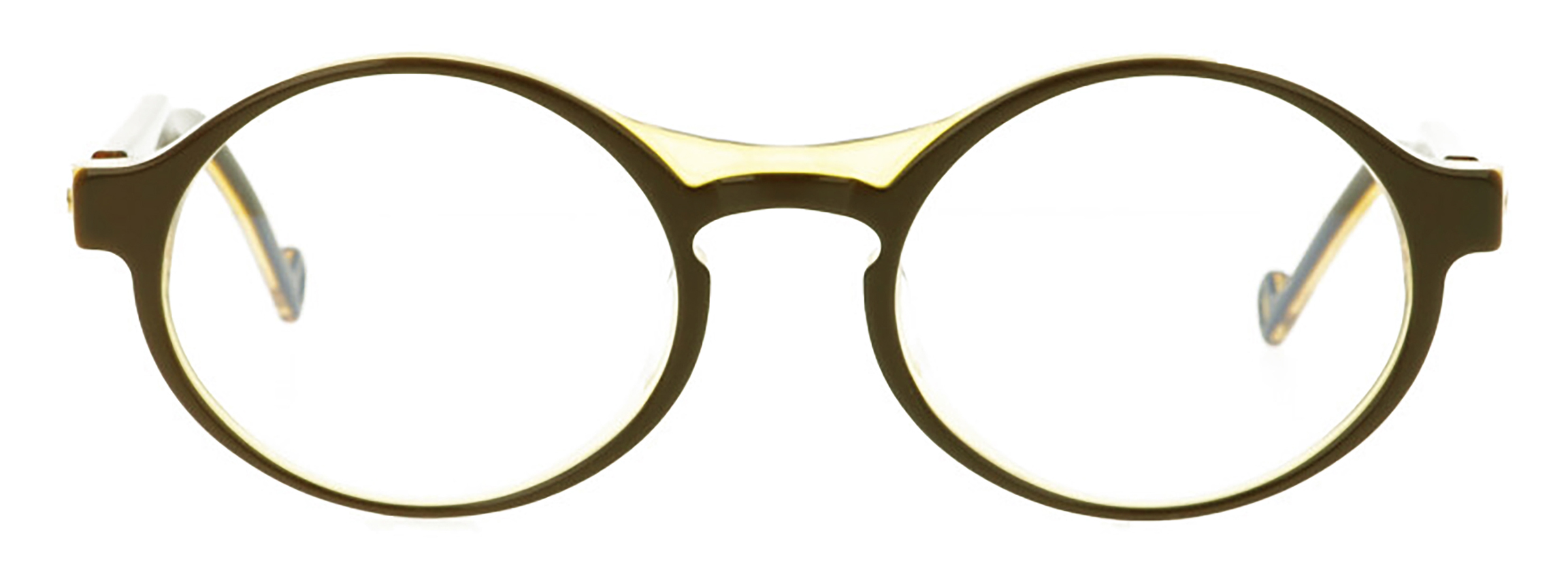
Baskerville C7
Burnt Umber/ OrpimentGolden Soul